
Departur is a travel-inspired brand rooted in curiosity, community, and design-forward exploration. Its visual language balances warmth and playfulness with structure, creating a flexible identity that feels expressive, inviting, and adaptable across platforms.
I developed the brand identity, visual system, print and digital assets, and campaign collateral, shaping Departur’s visual voice across web, social, and environmental formats.
Brand Identity · Visual Systems
Print + Digital Campaigns
Social Collateral · Art Direction

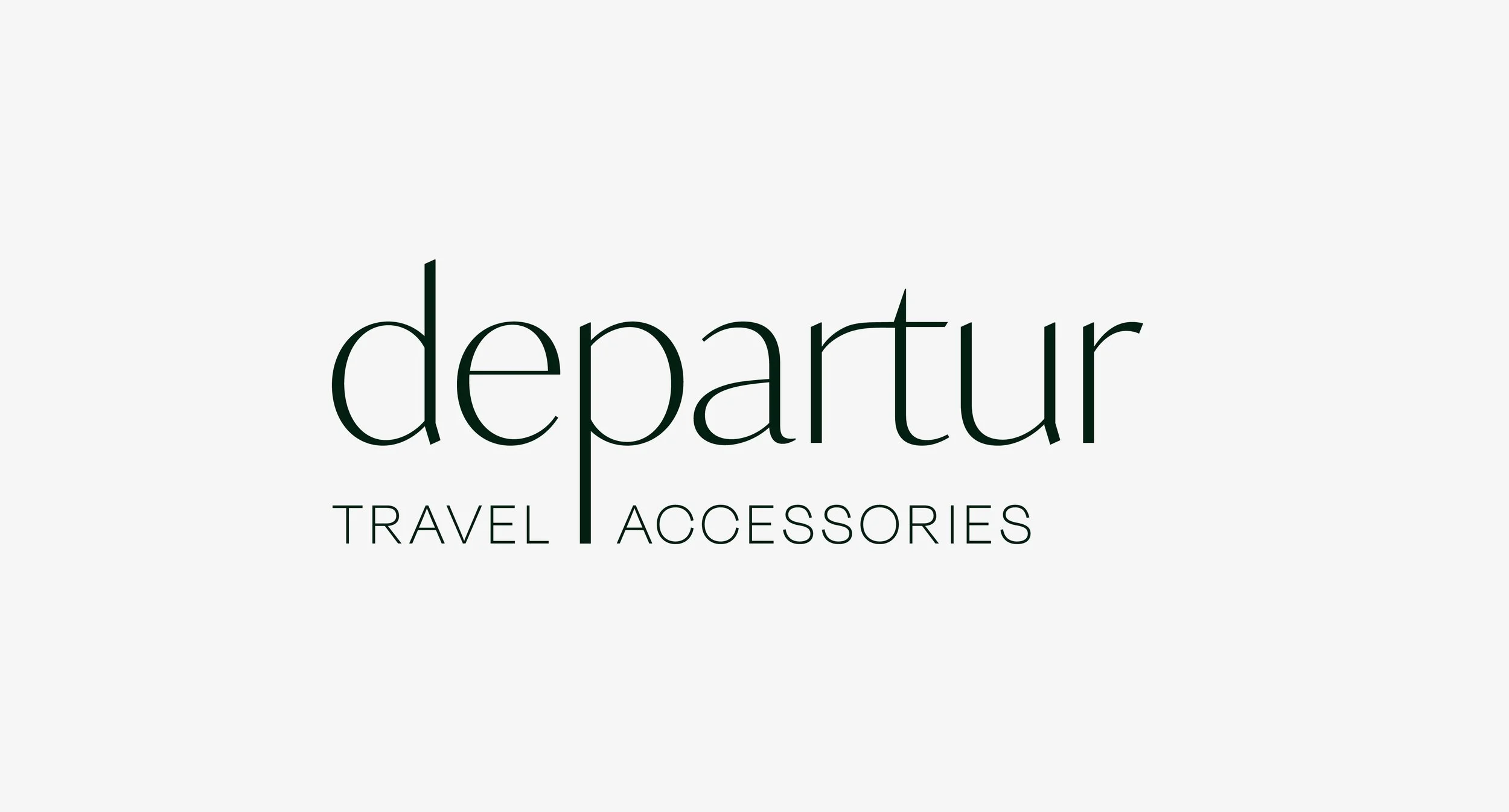
The identity pairs IvyMode and Degular typefaces to balance refinement with practicality, supporting a brand that feels aspirational yet accessible. The logo is typographic, designed to be modern, flexible, and legible across packaging and digital applications.
Subtle customizations, including the combined ‘T’ and ‘R’ and the elongated ‘P’ stem, reference movement and connection, drawing from ideas of paths, intersections, and travel routes.
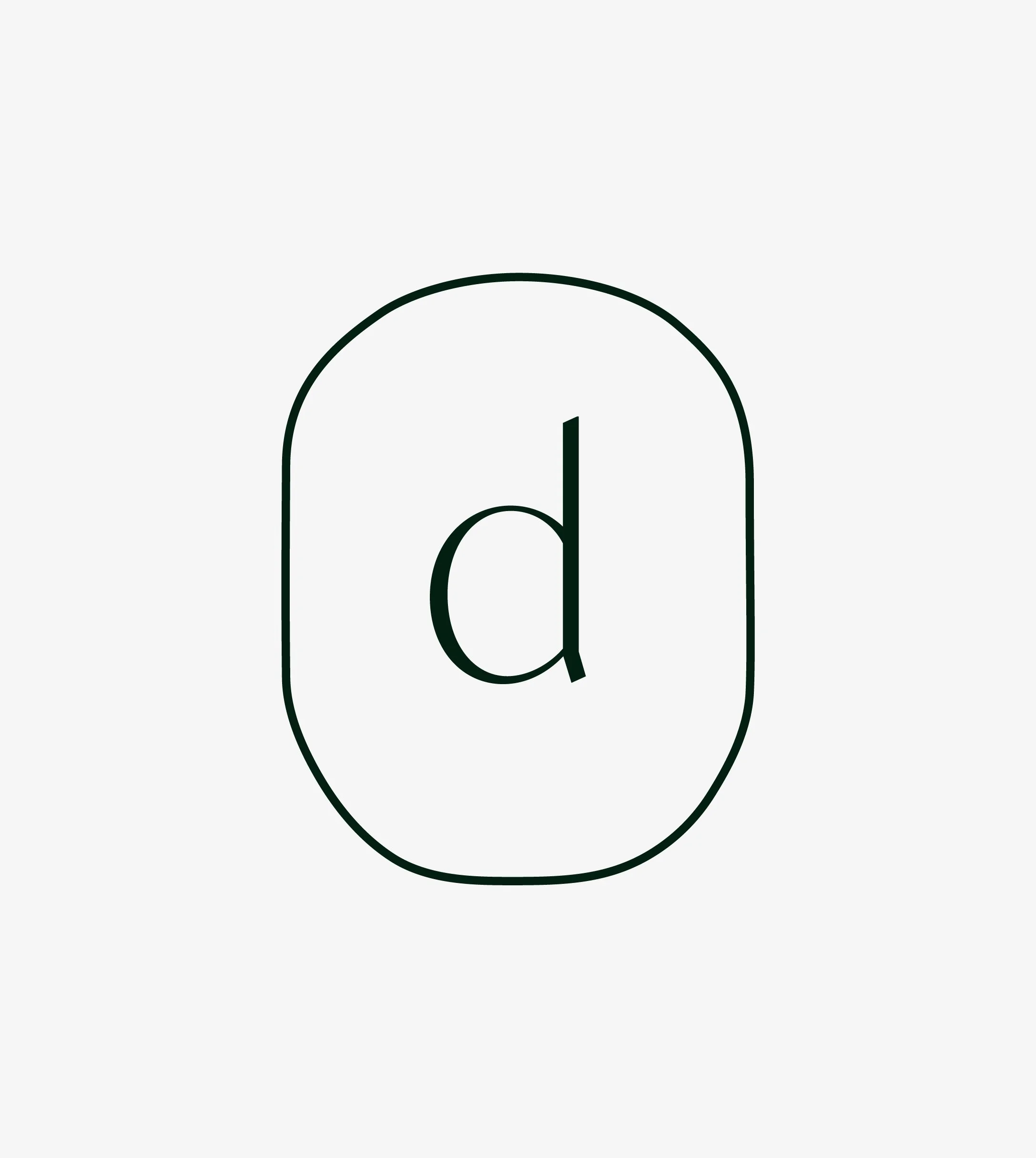

In Departur’s branding, the window icon is reimagined in various forms, seamlessly weaving through
hand-drawn illustrations and design elements, creating a cohesive and inviting travel aesthetic.

A Packaging System
The packaging system was developed as a modular framework that could support multiple SKUs while remaining cohesive. A simple rectangular box structure allows for efficient production and consistent presentation, while defined rules for logo placement, hierarchy, and copy ensure clarity across all sides of the package.
Photography is used selectively to reinforce the brand’s travel-oriented lifestyle, integrated in vertical compositions that mirror the logo’s orientation. When imagery is absent, the system relies on typography and color alone, maintaining consistency and recognition.


Digital and Print Touchpoints
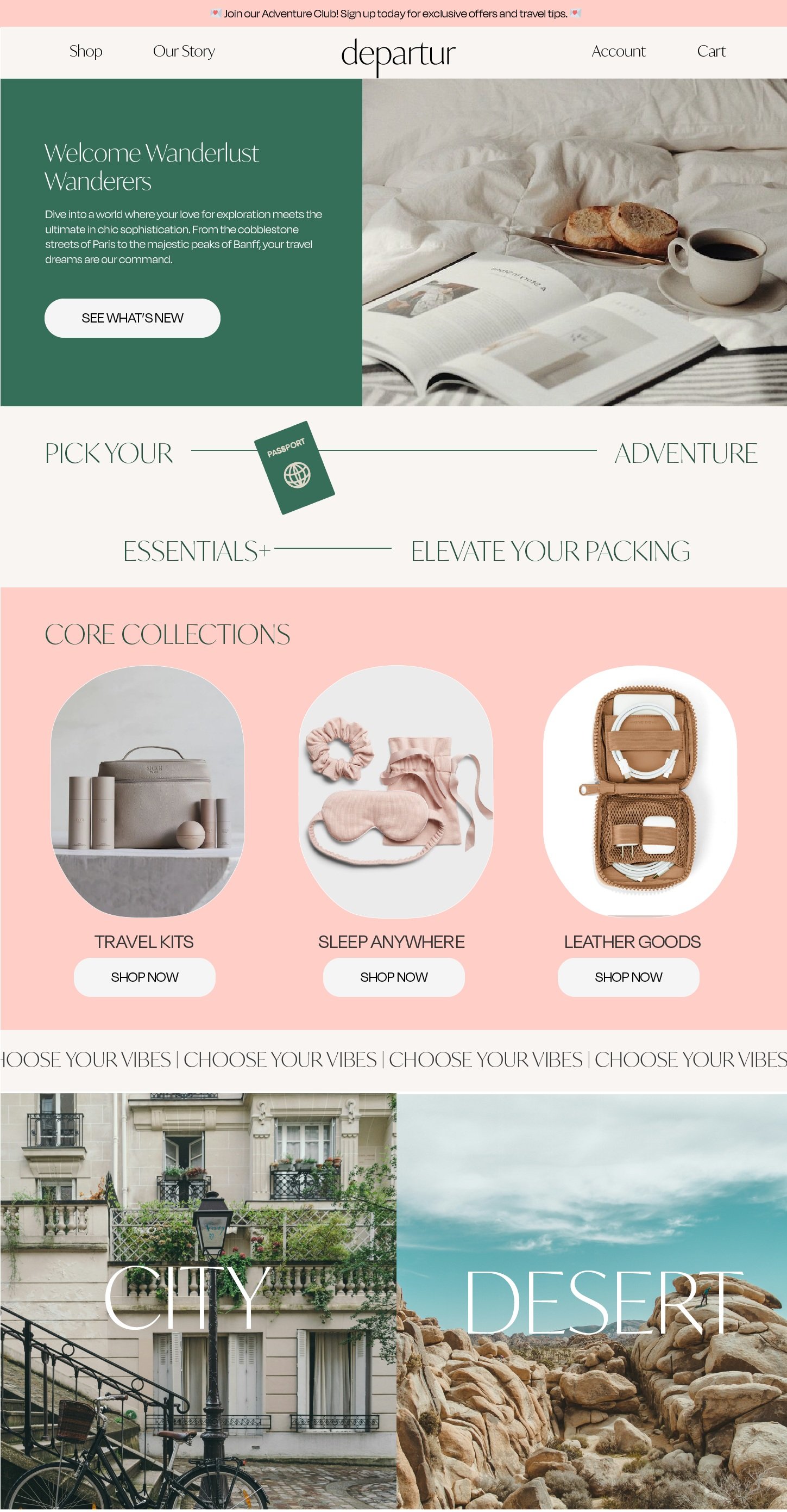
The website upholds the brand's core values of accessible, engaging travel. Icons and the window shape enhance consistency, blending functionality with a playful, sophisticated design.